We're 2.5 million strong—more than 1.7 million girls and 750,000 adults who believe in the power of every G.I.R.L. (Go-getter, Innovator, Risk-taker, Leader)™ to change the world. Since 1912, we’ve built girls of courage, confidence, and character who make the world a better place.
Girl Scouts New Brand Identity a Success on Year End Lists!
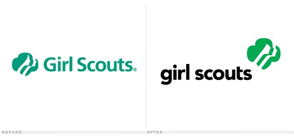
Rick Thompson at Customer Think places the new Girl Scout brand identity at number two in his Top Five Brand Identity and Logo Changes in 2010. He states,
"The new font with lower case has softer curves that are friendly and approachable, yet is has power and confidence carried by the black color. The icon with the girls faces retain the look and feel of the past, but include subtle enhancements to give it a more modern feel. Placing the icon to the upper right of the word mark provides a sense of dynamic movement that shows the organization is energized and moving forward."
Over at Brand New - one of my personal favorites - the Girl Scout refresh comes out with high marks as well. Armin writes,
"The much debated bang was a nice addition if you ask me and the perkier noses gave it a more youthful look. But the 'trefoil' icon was only part of a larger revitalization of the brand that resulted in a vibrant and playful array of identity elements."
As stated many times before, I'm a huge fan of our new look. Do you like the new Girl Scout brand identity?

 Rick Thompson at Customer Think places the new Girl Scout brand identity at number two in his Top Five Brand Identity and Logo Changes in 2010. He states,